Tutorial on binning, PDFs, CDFs, 1-CDFs and more

Introduction

In this course, we will need to plot various empirical probability distributions. As we deal with data, whose sparsity, and order of magnitudes may vary a lot, we have provided this tutorial to help you in producing appropriate visualizations of the data. But first, some mathematical background:

Discrete variables: Probability mass functions (PMF)

Let us assume we have some random variable \(V\) that can have only discrete values. Then the function describing the probabilities for different outcomes is a probability mass function (PMF) \(P(v)\). If we assume, for simplicity, that our random variable \(V\) can only take integer values, the probabilities for obtaining different values of \(V\) can be written as:

Continuous variables: Probability density function (PDF)

The counterpart of a PMF for a continuous random variable \(V\) is its probability density function (PDF), denoted also typically by \(P(v)\). For a probability density function \(P(v)\) it holds:

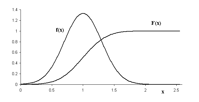
Example of a PDF denoted by f(x):

PDF and CDF (Figure from: http://physics.mercer.edu/hpage/CSP/pdf-cpf.gif)

(\(F(x)\) denotes the cumulative density function, more of that later)

Note that PDFs can have values greater than 1!

From now on in this tutorial, we mostly assume that we work with continuous random variables

In other words, we assume that the elements in our data are real numbers that arise from a distribution that is continously distributed, and described by a probability density function (PDF). In practice, the same methods can (usually) be used also when we are dealing with discretely distributed data, such as node degrees in a network.

Computing and plotting empirical PDFs:

Let us start by presenting data that are either (i) "narrowly" distributed, or (ii) have a fat-tail using standard matplotlib plotting settings:

In [1]:
import matplotlib.pyplot as plt

# this is only for this ipython notebook:
%matplotlib inline

import numpy as np

# "narrowly" distributed data, uniform distribution
rands = np.random.rand(10000)
# fat-tailed distribution
one_per_rands = 1./rands

fig = plt.figure(figsize=(12,6))
ax1 = fig.add_subplot(121)
ax2 = fig.add_subplot(122)

# basic histograms (see hist function below)
# work well with narrowly distributed data 
#
# option: normed = True
#     divides the counts by the total number of observations and by 
#     bin widths to compute the probability _density_ function
#
####################################################################
# NOTE (!)                                                         #
# With numpy.histogram, the option normed=True                     #
# does not always work properly!  (use option density=True there!) #
# However, when using matplotlib (ax.hist) this bug is corrected!  #
####################################################################

pdf, bins, _ = ax1.hist(rands, normed=True, label="pdf, uniform")
ax1.legend()
print "If the histogram yields a probability distribution," + \
        "the following values should equal 1:"
print np.sum(pdf*(bins[1:]-bins[:-1]))


pdf, bins, _ = ax2.hist(one_per_rands, normed=True, 
                        label='pdf, power-law')
ax2.legend()
print np.sum(pdf*(bins[1:]-bins[:-1])) # should equal 1"

print "Do they? Why should they?"
If the histogram yields a probability distribution,the following values should equal 1:
1.0
1.0
Do they? Why should they?

What about increasing the number of bins?

In [2]:
fig = plt.figure(figsize=(12,6))
ax1 = fig.add_subplot(121)
ax2 = fig.add_subplot(122)

_ = ax1.hist(one_per_rands, 10, normed=True, 
             label='PDF, power-law, 10 bins')
_ = ax2.hist(one_per_rands, 100, normed=True, 
             label='PDF, power-law, 100 bins')
ax1.legend()
ax2.legend()

print "Increasing the number of bins does not really help out:"
Increasing the number of bins does not really help out:

Solution: logarithmic bins:

Use logarithmic bins instead of linear!

In [6]:
fig = plt.figure(figsize=(12,6))
ax1 = fig.add_subplot(121)
ax2 = fig.add_subplot(122)

_ = ax1.hist(one_per_rands, bins=100, normed=True)
ax1.set_title('PDF, lin-lin, power-law, 100 bins')
ax1.set_xlabel('x')
ax1.set_ylabel('PDF')

# creating logaritmically spaced bins

print "Min and max:"
print np.min(one_per_rands), np.max(one_per_rands)


# create log bins: (by specifying the multiplier)
bins = [np.min(one_per_rands)]
cur_value = bins[0]
multiplier = 2.5
while cur_value < np.max(one_per_rands):
    cur_value = cur_value * multiplier
    bins.append(cur_value)
        
bins = np.array(bins)
# an alterante way, if one wants to just specify the 
# number of bins to be used:
# bins = np.logspace(np.log10(np.min(one_per_rands)), 
#                    np.log10(np.max(one_per_rands)), 
#                    num=10)

print "The created bins:"
print bins

bin_widths = bins[1:]-bins[0:-1]
print "Bin widths are increasing:"
print bin_widths
print "The bin width is always " + \
      "multiplied by a constant factor:"
print "bin_width[1]/bin_width[0]=", bin_widths[1]/bin_widths[0]
print "bin_width[2]/bin_width[1]=", bin_widths[2]/bin_widths[1]

_ = ax2.hist(one_per_rands, bins=bins, normed=True)
ax2.set_title('PDF, log-log, power-law, ' + str(len(bins))+ " bins")
ax2.set_xscale('log')
ax2.set_yscale('log',nonposy='clip')
ax2.set_xlabel('x')
ax2.set_ylabel('PDF')
Min and max:
1.00002863184 6629.89366212
The created bins:
[  1.00002863e+00   2.50007158e+00   6.25017895e+00   1.56254474e+01
   3.90636184e+01   9.76590461e+01   2.44147615e+02   6.10369038e+02
   1.52592259e+03   3.81480649e+03   9.53701622e+03]
Bin widths are increasing:
[  1.50004295e+00   3.75010737e+00   9.37526842e+00   2.34381711e+01
   5.85954276e+01   1.46488569e+02   3.66221423e+02   9.15553557e+02
   2.28888389e+03   5.72220973e+03]
The bin width is always multiplied by a constant factor:
bin_width[1]/bin_width[0]= 2.5
bin_width[2]/bin_width[1]= 2.5

Out[6]:
<matplotlib.text.Text at 0x7faa57c1e950>

Now we can see something in the tail as well! What is the slope of the PDF of 1/x, with \(x~Uniform(0,1)\) in the log-log scale? (For the interested: can you derive the analytical form of the PDF and calculate the slope using pen and paper?)

For intepreting log-log PDF plots, one just needs to know how different "standard" distributions look like (on a log-log scale).

Let's see how different distributions look like with different x and y scales:

In [4]:
# import from scipy some probability distributions to use:
from scipy.stats import lognorm, expon

# Trying out different broad distributions with 
# linear and logarithmic PDFs:

n_points = 10000

# power law:
# slope = -2! (why?)
one_over_rands = 1/np.random.rand(n_points)
# http://en.wikipedia.org/wiki/Power_law

# exponential distribution
exps = expon.rvs(size=n_points)
# http://en.wikipedia.org/wiki/Exponential_distribution

# lognormal (looks like a normal distribution in a log-log scale!)
lognorms = lognorm.rvs(1.0, size=n_points)
# http://en.wikipedia.org/wiki/Log-normal_distribution

fig = plt.figure(figsize=(15,15))
n_bins = 25

dist_data = [one_over_rands, exps, lognorms]
dist_names = ["power law", "exponential", "lognormal"]
for i, (rands, name) in enumerate(zip(dist_data, dist_names)):
    # linear-linear scale
    ax = fig.add_subplot(4, 3, i+1)
    ax.hist(rands, n_bins, normed=True)
    ax.text(0.5,0.9, "PDF, lin-lin: " + name, 
            transform=ax.transAxes)
    # log-log scale
    ax = fig.add_subplot(4, 3, i+4)
    bins = np.logspace(np.log10(np.min(rands)), 
                       np.log10(np.max(rands)), 
                       num=n_bins)
    ax.hist(rands, normed=True, bins=bins)
    ax.set_xscale('log')
    ax.set_yscale('log',nonposy='clip')
    ax.text(0.5,0.9, "PDF, log-log: " + name, 
            transform=ax.transAxes)
    # lin-log
    ax = fig.add_subplot(4, 3, i+7)
    ax.hist(rands, normed=True, bins=n_bins)
    ax.text(0.5,0.9, "PDF, lin-log: " + name, 
            transform=ax.transAxes)
    ax.set_yscale('log',nonposy='clip')
    # log-lin
    ax = fig.add_subplot(4, 3, i+10)
    bins = np.logspace(np.log10(np.min(rands)), 
                       np.log10(np.max(rands)), 
                       num=n_bins)
    ax.hist(rands, normed=True, bins=bins)
    ax.text(0.5,0.9, "PDF, log-lin: " + name, 
            transform=ax.transAxes)
    ax.set_xscale('log')
    
for ax in fig.axes:
    ax.set_xlabel('x')
    ax.set_ylabel('PDF(x)')

plt.tight_layout()
    
print "Distributions can look a lot different depending on the binning and axes scales!\n"
print "Note that PDFs can have a value over 1!"
print "(it is the bin_width*pdf which counts for the normalization)"
The history saving thread hit an unexpected error (OperationalError('disk I/O error',)).History will not be written to the database.
Distributions can look a lot different depending on the binning and axes scales!

Note that PDFs can have a value over 1!
(it is the bin_width*pdf which counts for the normalization)

Summary so far:

Don't want to bin? Use CDF(x) and 1-CDF(x)!

Representing PDFs using binning strategies can be difficult due to limited samples of data etc.. To neglect the need for binning, one can use the cumulative distribution function (CDF) and the complementary cumulative distribution function (1-CDF).

Cumulative density function (CDF(x)):

Complementary cumulative density function (cCDF(x), 1-CDF(x))

In [5]:
def plot_ccdf(data, ax):
    """
    Plot the complementary cumulative distribution function
    (1-CDF(x)) based on the data on the axes object.
    
    Note that this way of computing and plotting the ccdf is not
    the best approach for a discrete variable, where many
    observations can have exactly same value!
    """
    # Note that, here we use the convention for presenting an 
    # empirical 1-CDF (ccdf) as discussed above
    sorted_vals = np.sort(np.unique(data))
    ccdf = np.zeros(len(sorted_vals))
    n = float(len(data))
    for i, val in enumerate(sorted_vals):
        ccdf[i] = np.sum(data >= val)/n
    ax.plot(sorted_vals, ccdf, "-")
    # faster (approximative) way:
    # sorted_vals = np.sort(data) 
    # ccdf = np.linspace(1, 1./len(data), len(data))
    # ax.plot(sorted_vals, ccdf)
    
    
def plot_cdf(data, ax):
    """
    Plot CDF(x) on the axes object
    
    Note that this way of computing and plotting the CDF is not
    the best approach for a discrete variable, where many
    observations can have exactly same value!
    """
    sorted_vals = np.sort(np.unique(data))
    cdf = np.zeros(len(sorted_vals))
    n = float(len(data))
    for i, val in enumerate(sorted_vals):
        cdf[i] = np.sum(data <= val)/n
    ax.plot(sorted_vals, cdf, "-")

    # faster (approximative) way:
    # sorted_vals = np.sort(data)
    # now probs run from "0 to 1"
    # probs = np.linspace(1./len(data),1, len(data))
    # ax.plot(sorted_vals, probs, "-")


fig = plt.figure(figsize=(15,15))
fig.suptitle('Different broad distribution CDFs in' + \
             'lin-lin, log-log, and lin-log axes')
# loop over different empirical data distributions
# enumerate, enumerates the list elements (gives out i in addition to the data)
# zip([1,2],[a,b]) returns [[1,"a"], [2,"b"]]

dist_data = [one_over_rands, exps, lognorms]
dist_names = ["power law", "exponential", "lognormal"]
for i, (rands, name) in enumerate(zip(dist_data, dist_names)):
    # linear-linear scale
    ax = fig.add_subplot(4,3,i+1)
    plot_cdf(rands, ax)
    ax.grid()
    ax.text(0.6,0.9, "lin-lin, CDF: " + name, 
            transform=ax.transAxes)
    
    # log-log scale
    ax = fig.add_subplot(4,3,i+4)
    plot_cdf(rands, ax)
    ax.set_xscale('log')
    ax.set_yscale('log')
    ax.grid()
    ax.text(0.6,0.9, "log-log, CDF: " + name, 
            transform=ax.transAxes)

    # lin-lin 1-CDF
    ax = fig.add_subplot(4,3,i+7)
    plot_ccdf(rands, ax)
    ax.text(0.6,0.9, "lin-lin, 1-CDF: " + name, 
            transform=ax.transAxes)
    ax.grid()
    
    # log-log 1-CDF
    ax = fig.add_subplot(4,3,i+10)
    plot_ccdf(rands, ax)
    ax.text(0.6,0.9, "log-log: 1-CDF " + name, 
            transform=ax.transAxes)
    ax.set_yscale('log')
    ax.set_xscale('log')
    ax.grid()
    

Notes

Plotting 2D-distributions

What is the dependence between values of vectors X and Y?

First approach: simple scatter plot :

In [7]:
fig = plt.figure(figsize=(14,6))

n_points = 10000
x = np.exp(-np.random.randn(n_points)) + 1
# insert slight linear dependence! 
y = x*0.1 + np.random.randn(n_points)

ax1 = fig.add_subplot(121)
# alpha controls transparency
ax1.scatter(x,y, alpha=0.05, label="lin-lin scale")
ax1.legend()

ax2 = fig.add_subplot(122)
# alpha controls transparency
ax2.scatter(x,y, alpha=0.05, label="log-lin scale")
ax2.legend()
ax2.set_xscale('log')

Can we spot the slight trend?

Compute bin-averages! (with binned_statistic):

In [9]:
from scipy.stats import binned_statistic

fig = plt.figure(figsize=(14,6))
# linear bins for the lin-scale:

n_bins = 20
bin_centers, _, _ = binned_statistic(x, x, 
                                     statistic='mean', 
                                     bins=n_bins)
bin_averages, _, _ = binned_statistic(x, y, 
                                      statistic='mean', 
                                      bins=n_bins)
bin_stdevs, _, _ = binned_statistic(x, y, 
                                    statistic='std', 
                                    bins=n_bins)

ax1 = fig.add_subplot(121)

# Note: alpha controls the level of transparency
ax1.scatter(x,y, alpha=0.05, label="lin-lin")
ax1.errorbar(bin_centers, bin_averages, bin_stdevs, 
             fmt="o-", color="r", label="avg with stdev")
ax1.legend(loc='best')
ax1.set_xlabel("x")
ax1.set_ylabel("y")
print "Note the missing points with larger values of x!"

# generate logarithmic x-bins
log_bins_for_x = np.logspace(np.log10(np.min(x)), 
                             np.log10(np.max(x)), 
                             num=n_bins)

# get bin centers and averages:
bin_centers, _, _ = binned_statistic(x, x, 
                                     statistic='mean', 
                                     bins=log_bins_for_x)
# Note: instead of just taking the center of each bin, 
# it can be sometimes very important to set the x-value of a bin
# to the actual mean of the x-values in that bin!
#   (This is the case e.g. in the exercise where we implement 
#    the Barabasi-Albert network!)

bin_averages, _, _ = binned_statistic(x, y, 
                                      statistic='mean', 
                                      bins=log_bins_for_x)
bin_stdevs, _, _ = binned_statistic(x, y, 
                                    statistic='std', 
                                    bins=log_bins_for_x)

ax2 = fig.add_subplot(122)
ax2.scatter(x,y, alpha=0.06, label="log-lin")
ax2.errorbar(bin_centers, bin_averages, bin_stdevs, 
             fmt="o-", color="r", label="avg with stdev")

ax2.legend(loc='best')
ax2.set_xlabel("x")
ax2.set_ylabel("y")
ax2.set_xscale('log')
Note the missing points with larger values of x!

More sophisticated approaches for presenting 2D-distributions include e.g. heatmaps, which can be produced using using binned_statistic2d and pcolor. More of those later in the course!
Summary: